Blog / Arabic Typography in Gulf Marketing
Arabic Typography in Gulf Marketing
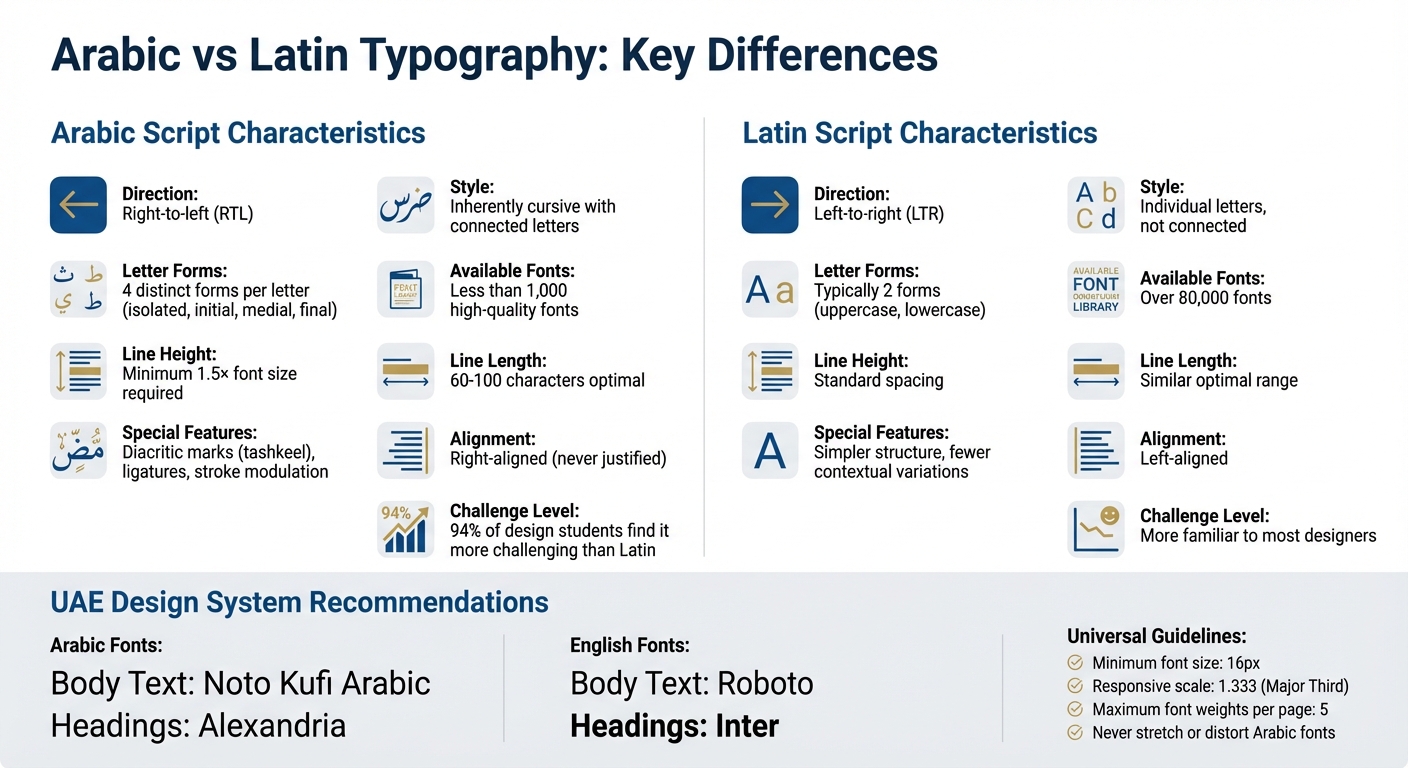
Arabic typography is more than just design - it’s a core element of brand communication in the Gulf region. For businesses targeting the UAE audience, the choice of Arabic fonts can influence trust, brand perception, and cultural alignment. However, designing effective Arabic typography comes with challenges, such as the limited availability of high-quality fonts (less than 1,000 compared to over 80,000 Latin fonts) and the complexity of the script, which requires attention to flow, spacing, and legibility.
Key points to consider:
- Typography as Identity: Fonts reflect cultural pride and values, as seen in the UAE's 2025 National Day campaign using Athelas Arabic Variable and Source Arabic Sans to unify the seven emirates.
- Technical Challenges: Arabic script is cursive, right-to-left, and requires adjustments for diacritic marks and ligatures. Proper line height (1.5× font size) and spacing are essential for readability.
- Bilingual Balance: In the UAE’s bilingual market, Arabic and English typography must align visually, with equal importance given to both scripts.
- Font Selection: Choose fonts that match the tone of your message. For example, serif fonts convey tradition, while sans-serif fonts suggest modernity.
- Avoid Errors: Stretching or distorting Arabic fonts disrupts their natural proportions and should be avoided.
Successful examples include the Dubai Font, which integrates Arabic and English harmoniously, and Coca-Cola’s personalized Arabic campaign, which resonated deeply with Gulf audiences. By prioritizing typography, brands can create designs that respect local preferences and stand out in the Gulf market.
Letters Reimagined: Exploring the Art of Arabic Typography | Wael Morcos
Arabic Typography Basics for Marketing
Arabic vs Latin Typography: Key Differences and Design Guidelines
How Arabic Script Works
Arabic script stands apart from Latin typography, and this difference plays a significant role in how Gulf audiences engage with written content. The script is inherently cursive, meaning that letters connect to form what designers often describe as a "flowing ribbon" of text. This continuous style is deeply ingrained in the expectations of native readers.
Each Arabic letter can take on four distinct forms - isolated, initial, medial, and final - depending on its position within a word. This contextual variation demands that designers pay close attention to how letters interact to ensure natural flow. Type designer Khaled Hosny highlights this complexity:
"Arabic script has a great and extensive history of development and refinement, and this is reflected in how many forms a letter can take, depending on its context".
Additionally, Arabic script follows a right-to-left (RTL) direction, which flips the layout logic compared to Latin scripts. The inclusion of diacritic marks (tashkeel) for vowels and pronunciation, along with intricate ligatures that combine multiple letters, adds another layer of complexity. These features require more vertical space, making a line height of at least 1.5x the font size essential for digital readability.
Traditional Arabic typography also incorporates stroke modulation, where the thickness of a stroke varies depending on the angle of the calligraphic pen. Kristyan Sarkis, a type designer, explains:
"I'm a firm believer that type is rooted in writing, even [in] the most constructed of typefaces. Whether in proportions or contrast, letters retain traces of their handwritten origins".
This link to calligraphic traditions is not just a stylistic choice - it’s what gives Arabic typography its authenticity and resonance for Gulf readers.
Interestingly, 94% of Middle Eastern graphic design students report finding Arabic typography more challenging to work with than Latin scripts. For marketers, this highlights the importance of collaborating with experts who understand these intricacies, rather than approaching Arabic typography as a simple translation task.
These technical details are the foundation of typography that feels natural and culturally relevant, setting the stage for its deeper connection to Gulf identity.
Typography and Gulf Identity
Arabic typography in the Gulf does more than convey words - it acts as a bridge between the region's rich calligraphic heritage and its modern commercial identity. The font you choose for your marketing campaign doesn’t just represent your brand; it also reflects your understanding of Gulf culture.
Huda Smitshuijzen AbiFarès, Director of the Khatt Foundation, explains the distinction:
"Arabic typography is often confused with Arabic calligraphy... calligraphy's beauty lies in the irregular mark made by a human hand... whereas typography is a mechanical process that focuses on creating exact repetition and order".
Even as typography adapts to the digital age, it must stay true to the visual characteristics that make Arabic script familiar and approachable to Gulf audiences.
Modern projects in the Gulf illustrate this balance beautifully. Take the Dubai Font, for example. Designed alongside its Latin counterpart, it ensures equal visual weight for bilingual content. This is especially important in the UAE, where brands must navigate a bilingual environment. Dr. Nadine Chahine, a leader in bilingual typography projects, notes:
"People sometimes see [Arabic] as old-fashioned and outdated, and if we have typefaces that show the language can be portrayed in a modern way, then this could be one way to invite people to read in Arabic again".
Custom typography has grown into a symbol of national pride, with fonts like Dubai Font being embraced by local brands and government institutions as a way to celebrate identity. For marketers, this underscores that typography choices go beyond aesthetic appeal. They signal whether your brand respects Gulf culture or treats Arabic as an afterthought.
Arabic Typography Design Guidelines
Creating Right-to-Left (RTL) Layouts
Designing for Arabic involves more than just flipping a left-to-right (LTR) layout. Since Arabic text flows from right to left, all elements - like menus and form fields - must align to the right to match this natural reading direction. This alignment impacts the overall design structure.
One common error is text justification. Justifying Arabic (or English) text often leads to uneven spacing between words, making it harder to read. Instead, Arabic text should be right-aligned, while English text stays left-aligned. Use centre alignment sparingly, such as for hero sections where both languages need equal emphasis.
Proper spacing is key for readability. Aim for a line height of 1.5× the font size and ensure sufficient space between letters and words to accommodate diacritical marks and connected letterforms. For line length, keep it between 60 and 100 characters per line. On a standard 1,240px-wide container, content should take up about 60% of the width (roughly 745px) to maintain a comfortable reading experience. Overly long lines disrupt the natural flow of Arabic reading.
Responsive design requires thoughtful adjustments. For headings, apply a "one-step decrease" rule on smaller screens. For example, an H1 on desktop should scale down to H2 or H3 on mobile, ensuring readability within limited screen space. The UAE Design System uses a "Major Third" scale (1.333) starting from 16px, creating a harmonious font progression across devices.
Next, we’ll delve into how bilingual typography enhances visual harmony in Gulf region designs.
Combining Arabic and English Typography
Balancing Arabic and English typography is critical in bilingual designs, especially in the UAE. Both scripts must share equal visual importance, which means selecting font families with similar stroke weights, baselines, and x-heights. This ensures that neither script feels visually dominant.
Mohamed Gaber, the designer of the Cairo typeface, explains:
"The goal is to create an Arabic typeface that matches the Latin without bending the Arabic letters or 'Latinizing' them - to maintain the classic rules of Arabic lettering while matching the Latin type".
This principle was applied to the Eid Al Etihad 54 branding in 2025. For this project, the committee paired Athelas Arabic Variable with Vinyl for English. These fonts were chosen to reflect the condensed lettering style of early Emirati street signs and licence plates. Strict guidelines prohibited altering the typefaces (e.g., stretching or rotating) to preserve the UAE’s national identity.
For digital interfaces, the UAE Design System suggests using Noto Kufi Arabic for body text and Alexandria for headings in Arabic. For English, Roboto is recommended for body text, and Inter for headings. Consistency in alignment, font sizes, weights, and colours across both languages is essential for a clear hierarchy. Arabic text should always be right-aligned, while English remains left-aligned.
When displaying prices with the UAE dirham symbol, ensure the symbol matches the font, size, and weight of the digits. The symbol should appear to the left of the number, maintaining the same height and baseline. This attention to detail reinforces brand trust and aligns with Gulf market expectations.
A great example of bilingual typography in action is the "Almost There" Film Festival poster. It showcases how aligned letterforms can unify Arabic and English messaging seamlessly.
Font Selection and Colour Pairing
Choosing the right fonts is about more than aesthetics - it’s about functionality and accessibility. Fonts should reflect the tone of the content while being easy to read for a wide audience.
For digital content, start with a minimum font size of 16px. Use bold or extra bold weights for headings to draw attention, while regular or medium weights work best for body text to maintain readability. Limit font weights to five per page to avoid clutter and ensure smooth performance.
The Dubai Font project, launched in April 2017, is a prime example of balanced bilingual typography. Designed by Nadine Chahine and Ahmad Al Mahri, the font was developed to respect Arabic heritage while functioning as a "workhorse" for both government and public use. Chahine described the challenge:
"When we put the Arabic and the English together, the English looked very nice and the Arabic looked poor and this is not OK... we need to be able to speak at the same level and to have harmony and coexistence at the same level".
Colour choices should also resonate with Gulf audiences. For instance, the Eid Al Etihad 54 branding used three palettes: Flag, Heritage, and the Seven Emirates Palette. Official logos or currency symbols should be displayed in black or white for clarity, avoiding gradients or decorative effects.
On 27 March 2025, the UAE Central Bank introduced a new national currency symbol with strict usage guidelines. The symbol must be placed directly before the numeric value, matching the font, size, and weight of the digits. This ensures consistency across digital and physical platforms.
| Element | Recommended Arabic Font (UAE Design System) | Recommended English Font (UAE Design System) |
|---|---|---|
| Primary/Body | Noto Kufi Arabic | Roboto |
| Secondary/Headings | Alexandria | Inter |
Arabic Typography Challenges and Solutions
Preventing Font Stretching and Distortion
One of the most critical mistakes in Gulf marketing is stretching or distorting Arabic fonts. Unlike Latin scripts, Arabic letters change shape depending on their position in a word - whether isolated, at the beginning, middle, or end - making the script far more intricate to mechanise or code. When designers manually stretch text, they disrupt the script's natural proportions, undermining its calligraphic beauty and balance.
To address this, the Dubai Font was introduced in April 2017 by the Dubai Executive Council in collaboration with Microsoft and Monotype. Created by Dr. Nadine Chahine, this was the first font designed specifically for a city and integrated into Microsoft Office 365, making it accessible to over 100 million users. Institutions like Dubai Courts and Index Holding quickly adopted it for official communications, aligning with Dubai’s forward-thinking brand identity. What set this project apart was its Arabic-first design approach, ensuring the script wasn’t forced to conform to Latin design standards. As Dr. Chahine explained:
"Usually the Latin is designed first, but that gives you less freedom with what you can do with the Arabic, which then has to follow the Latin and so you inherit design decisions that you would not have wanted to face".
For modern typography, using responsive systems is essential. These systems adjust font sizes based on screen dimensions, applying strategies like the "one-step decrease" rule, where headings scale down from H1 to H2 or H3 on smaller screens. Additionally, OpenType software significantly simplifies Arabic font creation by automating ligatures and contextual alternates, reducing development time by up to 60%.
These measures highlight the importance of rigorous cross-device testing to maintain quality.
Testing Legibility Across Devices
Once fonts are designed to preserve their proportions, the next step is ensuring they are legible across all devices. With Arabic internet users surging from 46 million in 2007 to over 170 million by 2017, testing for readability across devices has become a critical priority for Gulf marketers.
To maintain clarity, digital assets should be tested on screens smaller than 1,536px and between 1,536px and 2,500px. For larger screens, increasing the base font size to 18px (text-lg) enhances accessibility. To optimise page performance, limit font weights to five per page, using heavier weights like bold or extrabold for headings and neutral weights like regular or medium for body text.
Respecting Typography Conventions
Typography in Arabic design must respect both aesthetic and cultural conventions. For instance, the Dubai Font’s terms of use explicitly prohibit its application in ways that violate regional cultural standards. Designers should avoid outdated decorative elements that mimic traditional calligraphy, as there’s a growing preference for clean, modern fonts that resonate with younger audiences.
When formatting Arabic text digitally, never justify the text. Justification creates uneven spacing, which slows reading and disrupts the natural flow of the script. Additionally, underlines should only be used for hyperlinks, as using them for emphasis can confuse readers.
Given the limited availability of high-quality Arabic fonts, adhering to these conventions is crucial. Every font choice carries cultural and aesthetic significance, making thoughtful typography a vital aspect of successful Gulf marketing.
sbb-itb-058f46d
Arabic Typography in Gulf Marketing Campaigns
Emirates Airlines' Typography-Led Branding

Emirates Airlines has mastered the art of typography to reinforce its premium image and cultural identity. From the bold logotype on boarding passes to the branding on aircraft livery, every detail reflects consistency and precision. This attention to detail ensures that typography becomes a hallmark of their premium service. By avoiding practices like "Ali Baba typography" - where Latin text is manipulated to resemble Arabic forms inauthentically - the airline maintains a design language that feels both genuine and sophisticated. This meticulous approach also sets the foundation for smooth bilingual experiences in other Gulf marketing efforts.
Careem's Bilingual User Experience
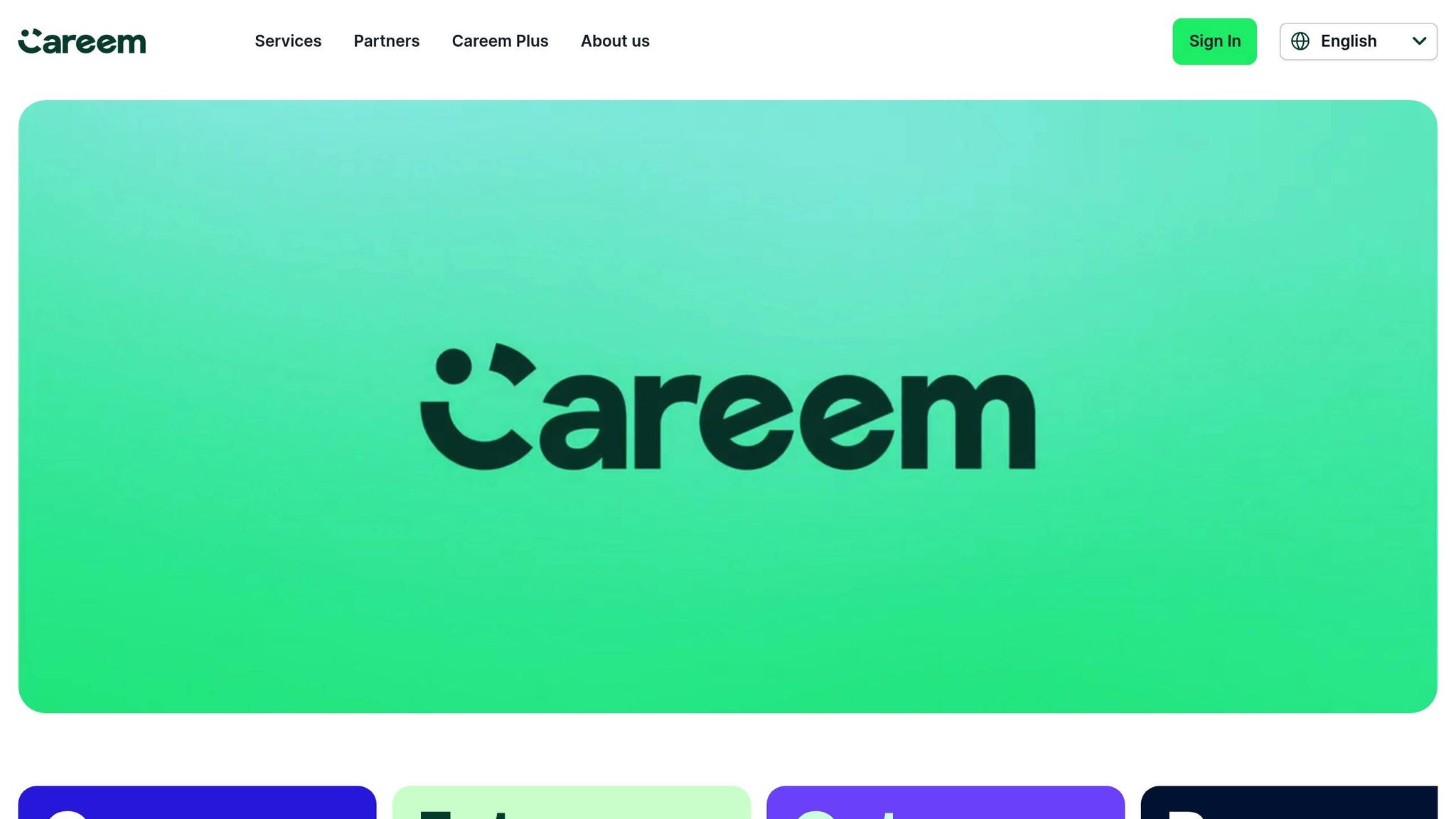
Careem offers a seamless blend of Arabic and English in its visual identity, using custom typefaces to balance creativity with functionality. Their "Careem Bold" typeface is used for headlines, while the practical "Inter" font handles user interface elements. This combination ensures clarity across all text sizes, creating a versatile and user-friendly experience. As outlined in their brand guidelines:
"Our typography flexes from functional to expressive, from the largest headlines to the smallest copy lines. It helps us share our unique Careem voice with the world."
By applying the Gestalt principle of proximity, Careem ensures intuitive navigation for both local and expatriate users across the Gulf Cooperation Council (GCC) region. This thoughtful design approach makes their platform equally accessible and appealing to diverse audiences.
Coca-Cola's Personalised Arabic Campaign
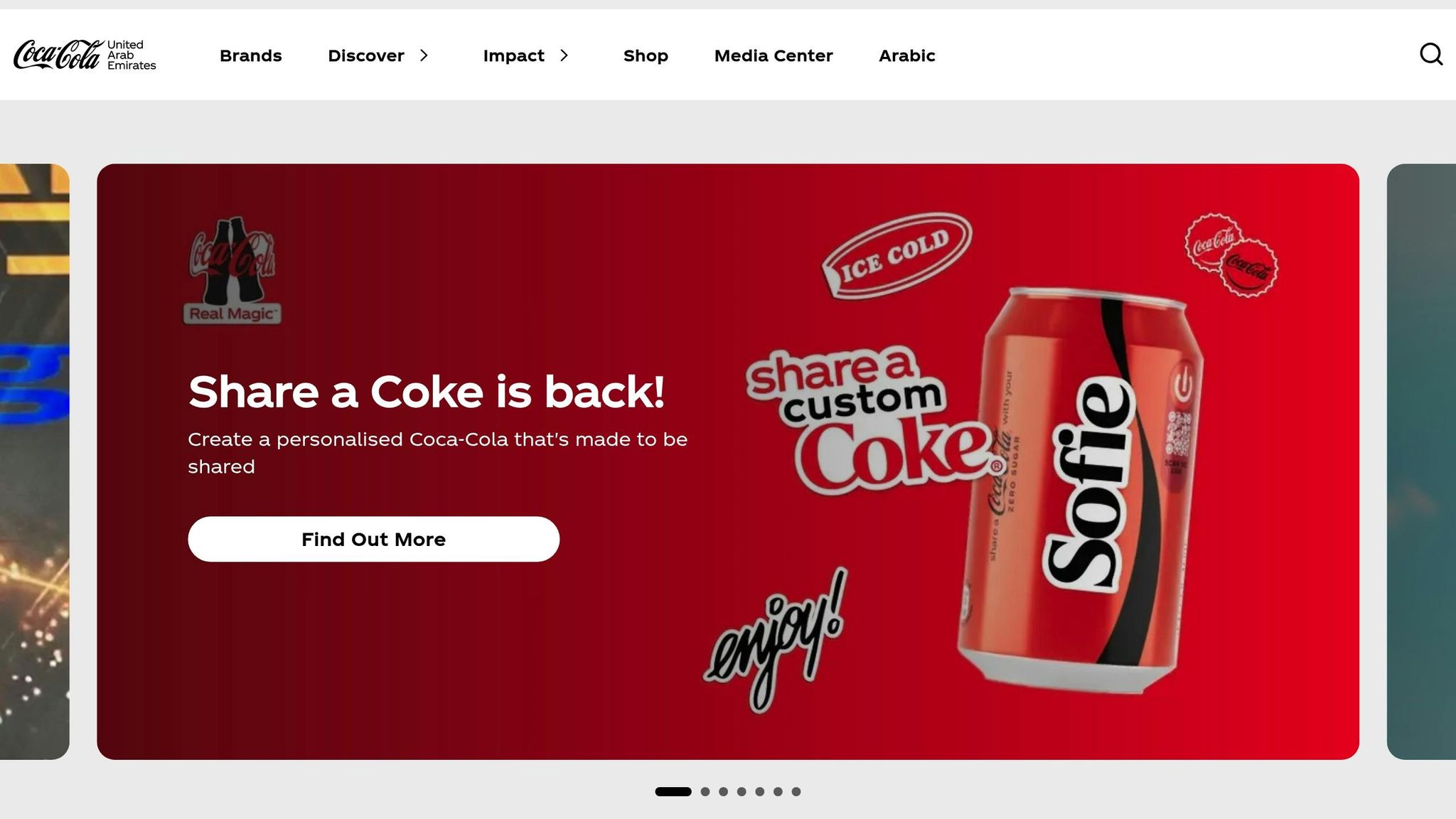
Global brands have also embraced Arabic typography to connect with Gulf audiences. Coca-Cola’s 2015 "Share a Coke" campaign is a standout example. The brand replaced its iconic logo with popular Arabic nicknames like Ahlam, Mohamed, and Nouf, creating a personalised touch that resonated deeply with local consumers. By incorporating these familiar names into elegant Arabic script, the campaign struck an emotional chord, fostering a sense of authenticity and local identity. Mohammad Junaid Khan, Head of Marketing at Takaful Emarat, highlighted this impact:
"Arabic calligraphy creates more emotional reference to the consumers".
For international brands operating in the Gulf, such initiatives go beyond marketing - they establish a meaningful connection with the region's culture. These examples demonstrate how typography can bridge cultural gaps while strengthening brand identity in Gulf markets.
Wick's Four Pillar Framework for Typography-Driven Marketing
Wick's Four Pillar Framework takes typography beyond aesthetics, turning it into a key strategic tool for marketing in the Gulf region. By integrating data-driven insights and respecting local design principles, this framework ensures a seamless connection between visuals and cultural relevance.
Build & Fill: Establishing a Solid Visual Base
Creating a strong visual foundation starts with adhering to the UAE Design System's typography guidelines for both Arabic and English content. For body text, a minimum size of 16px and a responsive scale of 1.333 are recommended.
Arabic content should follow a right-to-left (RTL) layout, while English remains left-aligned. Avoid text justification entirely, as it can slow down reading speed. For bilingual wordmarks, position Arabic text on the top line and English on the second, using kashidas to balance the design. Additionally, a line height of 1.5x and paragraph margins of 2x enhance readability. Responsive design principles ensure headings adjust based on screen size - H1 scales down to H2 at 1536px, and to H3 at 1024px.
This structured approach lays the groundwork for impactful campaigns.
Plan & Promote: Leveraging Arabic Typography for Campaign Success
Typography can become a powerful distribution tool when amplified strategically. The launch of the Dubai Font in April 2017 is a prime example. Designed by Dr. Nadine Chahine and integrated into Microsoft Office 365, the font reached 100 million users across 180 countries. Wick applies similar strategies by limiting font weights to five per page to ensure faster loading times. A clear visual hierarchy - using size, weight, and colour - guides users naturally through content.
This meticulous attention to detail allows campaigns to excel across various channels, from paid ads to influencer collaborations, without compromising their cultural alignment.
Tailor & Automate: Customising Typography for Gulf Audiences
Typography can reflect the unique voice of its audience when tailored effectively. Dr. Nadine Chahine highlights the importance of a Type Design Brief to define personality traits, whether the tone needs to be "loud and confident" for news platforms or "fun and informal" for children's content.
"Typography is the voice with which a language visually communicates."
Wick’s automation tools ensure that bilingual designs remain consistent and culturally aligned. Instead of adapting Arabic script to fit Latin text, both scripts are developed collaboratively to uphold a unified brand identity. Line lengths are kept between 60 and 100 characters for better readability. By combining this precision with AI-driven personalisation, Gulf brands can maintain consistency across thousands of touchpoints while adapting to individual user preferences.
Conclusion
Arabic typography plays a pivotal role in shaping how Gulf audiences perceive and connect with brands. When thoughtfully designed, it becomes much more than just a visual element - it communicates respect for local culture, builds trust, and engages audiences even before they’ve read a single word.
Investing in well-crafted Arabic typography sets brands apart in the Gulf market. The choice of font directly impacts credibility; a poorly chosen font can diminish trustworthiness, while a legible and appealing one draws attention and fosters connection. This makes typography not just an aesthetic choice but a practical necessity for standing out in the region.
To thrive in the Gulf, brands must treat Arabic and English scripts with equal importance. Dr. Nadine Chahine’s work on the Dubai Font is a prime example of this approach, demonstrating how typography can reflect regional pride and sophistication. This philosophy has led to remarkable milestones, such as Emirates Airlines' typography-driven branding and the Dubai Font’s adoption by over 100 million Microsoft Office 365 users across 180 countries.
As highlighted earlier, effective typography in the UAE requires careful attention to right-to-left layouts, seamless bilingual integration, rigorous testing across devices, and ensuring readability. Whether it’s a social media post or a full-scale brand identity, typography must embody the elegance and cultural pride of Gulf audiences.
Brands that succeed here understand that typography isn’t just decorative - it’s the backbone of trust, recognition, and long-term customer loyalty. This foundation, explored throughout this guide, is at the heart of every successful marketing strategy in the Gulf.
FAQs
Why is Arabic typography essential for brand communication in the Gulf region?
Arabic typography plays a key role in shaping a brand’s identity and improving communication with Gulf audiences. It ensures that text is clear, culturally appropriate, and meets the expectations of local consumers. In the UAE, design principles such as clarity, balance, and personality influence the choice of Arabic fonts, enabling brands to maintain a polished and consistent presence across both digital and print media.
Using genuine Arabic typography brings an added layer of cultural connection and trust, which resonates strongly with local audiences. Carefully selected fonts not only enhance usability but also spark positive emotions, creating a lasting impact. By applying these principles, brands can build meaningful relationships with Gulf consumers and solidify their position in the market.
How can brands create a cohesive balance between Arabic and English typography in the Gulf region?
Creating a balance between Arabic and English typography in the Gulf region requires careful consideration to ensure both scripts feel natural while reflecting the brand’s identity. To achieve this, it’s essential to select Arabic and Latin typefaces that share similar visual traits - like geometry, proportions, and weight. This creates a unified and visually pleasing design across both languages.
For instance, pairing modern English fonts such as Roboto or Inter with Arabic fonts like Noto Kufi Arabic or Alexandria can work effectively. Maintaining consistency in font weights (e.g., normal 400, semi-bold 600, bold 700) and using a unified responsive scale starting at 16 px (1 rem) further enhances balance. Fonts designed specifically for both scripts, such as the Dubai Font, offer a seamless solution for bilingual designs.
Brands like Wick can apply these typography principles within data-driven workflows to meet UAE localisation standards. This involves using AED currency formats (e.g., AED 1,000.00), dates in DD/MM/YYYY format (e.g., 31/03/2025), and culturally appropriate design elements. By tailoring typography and design to local preferences, brands can create a polished and inclusive experience that connects with Gulf audiences.
What should designers avoid when creating Arabic typography for Gulf audiences?
Designing Arabic typography demands a deep understanding of both the language and its cultural context. A common pitfall is overlooking the contextual nature of Arabic letters. Unlike Latin-based scripts, Arabic letters change shape depending on their position in a word - whether at the beginning, middle, or end. Applying Latin script conventions, like fixed letterforms or uppercase and lowercase distinctions, can lead to designs that feel unnatural and are harder to read.
Another frequent issue arises from ignoring spelling or grammatical accuracy within the typography. Mistakes in diacritic placement, such as with the hamza or tanween, can cause confusion for readers, particularly in highly visible spaces like airports. Additionally, some designers mistakenly equate Arabic calligraphy with Arabic typography, resulting in overly ornate designs. While beautiful, such intricate styles often sacrifice readability, especially in digital or print formats.
Lastly, failing to account for the right-to-left writing direction and proper letter spacing can create serious readability challenges. This is especially problematic in digital interfaces, where poor alignment or uneven spacing disrupts the user experience. Thoughtful spacing and alignment not only enhance readability but also demonstrate respect for the cultural and linguistic preferences of Gulf audiences.